+ LeCreuset | Case Study
E-Commerce
Optimization
With the goal of optimizing the mobile shopping experience, Le Creuset asked for design solutions that would improve conversion and customer satisfaction informed by extensive quantitative & qualitative research. Deliverables would include device agnostic design artifacts, rapid prototypes, research, and documentation within 200 hours of exploration & implementation.
0 1 2 3 4 5 6 7 8 9 0 1 2 3 4 5 6 7 8 9 0 1 2 3 4 5 6 7 8 9 0 1 2 3 4 5 6 7 8 9
0 1 2 3 4 5 6 7 8 9 0 1 2 3 4 5 6 7 8 9 0 1 2 3 4 5 6 7 8 9 0 1 2 3 4 5 6 7 8 9
Design System
Implementation
In 1925, Armand De Saegher and Octave Aubecq opened the first cast iron foundry, laying the foundation for what we now know as Le Creuset cookware. The company has been a kitchen staple for 100 years but lacked the brand presence and digital experience necessary to humanize their ethos. Given their rich history and beautiful product line, I implemented various aesthetic updates to modernize this prestigious brand.
Commerce Optimization
Due to the limited number of brick-and-mortar locations, many customers rarely have the opportunity to encounter LeCreuset products in person. Older demographics also face challenges in transporting purchases due to their size and weight. My field study revealed that consumers often misinterpreted product serving sizes due to limited showroom displays, a disjointed web experience, and inadequate product details, both in-store and online.
WCAG
Conformance
The journey began with a custom-built ecommerce website tailored to business requirements. However, transitioning to a human-centered approach over time resulted in incremental adjustments that led to a disjointed experience, leaving consumers feeling disconnected and prone to cart abandonment. Proposing a data-driven and accessible design approach would ensure improved usability and navigation for both current and prospective consumers.
Framing
the Problem
Browsing the LeCreuset website posed several challenges, including usability, accessibility, and aesthetic issues, among others. To address these issues effectively, I adopted a lean UX strategy, which involved thorough research, workshops, and field studies. Our future plan involved transitioning from a custom-built platform to an off-the-shelf ecommerce solution like Magento for improved functionality and user experience.
User Research
& Metrics
PROCESS | DISCOVERY
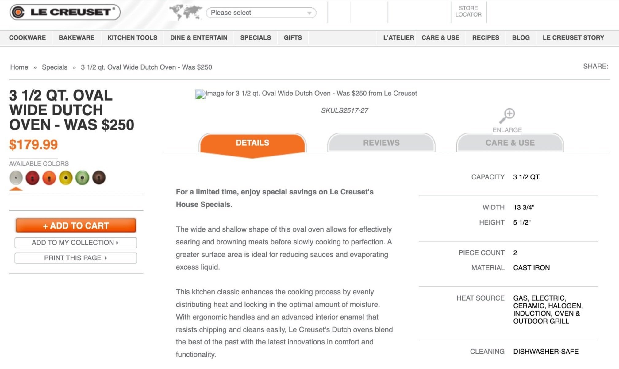
My initial research methods would include a SWOT analysis of the current experience as well as reviewed heat maps collected via Optimizely. The results where triangulated with Google Analytics to reveal issues along the user journey [with a primary focus on Product Listing and Product Detail pages]. User testing was used to rationalize expert bias and alignment with user pain points.
Data would conclude that Product Listing pages were suffering from a bounce rate of over 50% due to the inefficient use of screen real estate (mobile : with a single column layout) and an un-engaging presentation of key product details such as color.
2013 Web Image | www.lecreuset.com
Qualitative Data - Optimizely
“Category pages were suffering from a bounce rate of over 50% due to the inefficient use of real estate”
Qualitative Data - Optimizely
“On Product Detail pages, about 67% of sessions were exiting without any engagement”
User Testing - Interviewee I
“The experience feels lacking because I love the products, but don’t love this page.”
User Testing - Interviewee II
“In real life, I would not scroll this much to find what I was looking for”
Qualitative
Analysis
PROCESS | ASSESSMENT
I employed research from Neilson Norman and The Baynard institute to guide our qualitative audit. Working within the Magento platform would present limitations, but allow for innovation through interface design. The notes below were gathered throughout our exploration where I couple our analysis with quantitative metrics to validate our proposed UX strategy.
Out of Stock notifications important (Notifications)
Cast Iron, Enamel on Steel, Stainless Steel, Stoneware
Brand story merged with consumer interactive
Merging the documentation w/ Product & Brand Story
Data speaks to female engagement
Large traffic from 18-35 age demographic (low conversion)
Tablet environment / Omni experience
Products at a glance
Ease of navigation
Keyword tagging for colors / Humanize the experience
Reviews will dictate buying decision and conversion
Seasonal sub navigation items (Below main navigation)
Show signature retailer at high level (Location CTA)
Color of purchase should be very obvious
Improving click radius and visibility throughout site
Millennial, Contemporist, Early Adopter/ Adapter
Using infographics / Icons to convey messages
Technical writing imperative to design
Humazing the product
Recipes with related products
Recipe repository
Image mapping implementation
Image replacement for hotspots (Threshold)
CMS page & Style Guide for marketing pages (Guides)
Icons within filter navigation
Display Inventory threshold (Epicore plugin)
Products present on homepage
Scale wide screen view
Parallax possibilities
Sharing story (Community & Social)
Customer service (Chat)
CMS homepage in reference to Hierarchy
Intersticial login filter
Carousel / Video or Hero
Readability
Signature Stores highly content recommended (Store Locator)
Customized Store locator CMS page
Heuristic
Evaluation
PROCESS | ASSESSMENT
I conducted a heuristic workshop which included several stakeholder meetings within one room for 16 hours over 2 days. This workshop would be led by me and our creative director and would consist of gathering specifications and business insight to help optimize the experience.
I walked the team through each instance of the Magento user flow and recorded details for each page via sketch or traditional note taking. Below are some notes gathered throughout the 2-day discussion, these line items would then support our design thinking and UX strategy as well.
Compare functionality (Reference Candelabra)
Secondary site wide banner (100px height)
Geo location (Experience, Store Locator)
Mailing list subscription (Sign up options)
Blog (Lifestyle, History, Color)
Store Locator (Type, Hours, Deals, Geo IP, Events, etc.)
CMS Store Locator & Event Page (Structured Content)
Add to registry (Gifting)
Global
Understanding product size (Category, Product)
Out of stock needs to be clear
Guides and receipt at high level (Tie to product)
understanding volume and size
Size is most important variable
Size and color before shape
Clear navigation / Readability / Usability
Story driven environment
24 to 35 year old demographic
Males convert at a higher rate*
Majority are new visitors
Visitors went to cookware page more than homepage
Organic, Paid, Email, Social (Search terms)
Full screen customization / 1024 res. visited the most
User Journey
Shop by color (Filter)
Matching colors to colors
Shop by size / Number of servings
Shop by material
Shop by type
Connect recipes to product
Shop by collection (Collection = Color)
Category
Ajax mini cart
Store & Stock status
Attribute flags (Clearance, Sale)
Attribute Hierarchy
Sign up notifications tied to stock
Tiered pricing and content videos
Detailed product descriptions
Product
Ideation
& Exploration
PROCESS | EXPLORATION
I worked alongside LeCreuset brand specialists to discuss consumer interest and business initiatives surrounding their mobile and web experience. We would then meet with several stakeholders for discovery and exploration opportunities to optimize their present day experience (i.e, New Icons, Fixed Width Font, LC 101, etc.).
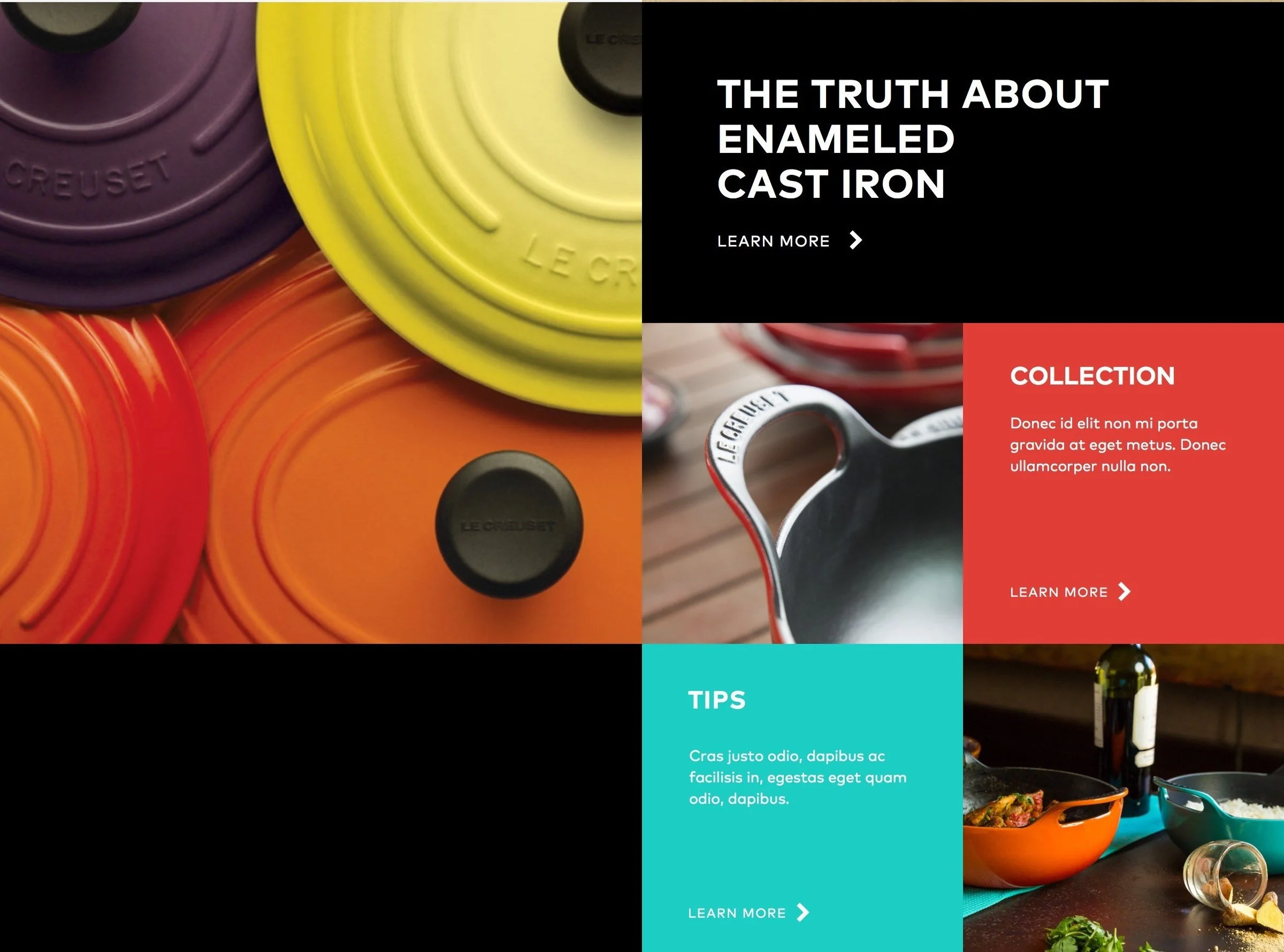
Understanding the history of LeCreuset and it's evolution of cast iron through the cauldron in the early 1900s gave us a glimpse of Bauhaus and Germany's culture during this time period. LeCreuset (Ms. Faye) emphasized the presence of joy within every experience surrounding their products and the importance of translating that into our optimized design.
Founded by Walter Gropius in Weimar.
Form follows function.
Bauhaus - House of Construction
xWork of Art utilizing multiple mediums & design specialties
Profound influence on Art / Design from 1918- 33
Le Creuset began producing its first porcelain enamelled cast iron pots in 1925 from its foundry in France.
Design Theory
Geometrical shapes
Figure bounded by 1 line
Circumference : The bounding line around circle
Point - Center of circle
The set of points in a plane (flat) that are a a consistent distance from a center point
Circles divided planes into 2 regions (Interior & Exterior)
Arc : Connected part of Circle
Segment : a regions not containing the center
Radius : Line segment joining any part of the Arc to the center point
Research (Bauhaus)
Concepts
& Solution
PROCESS | SOLUTION
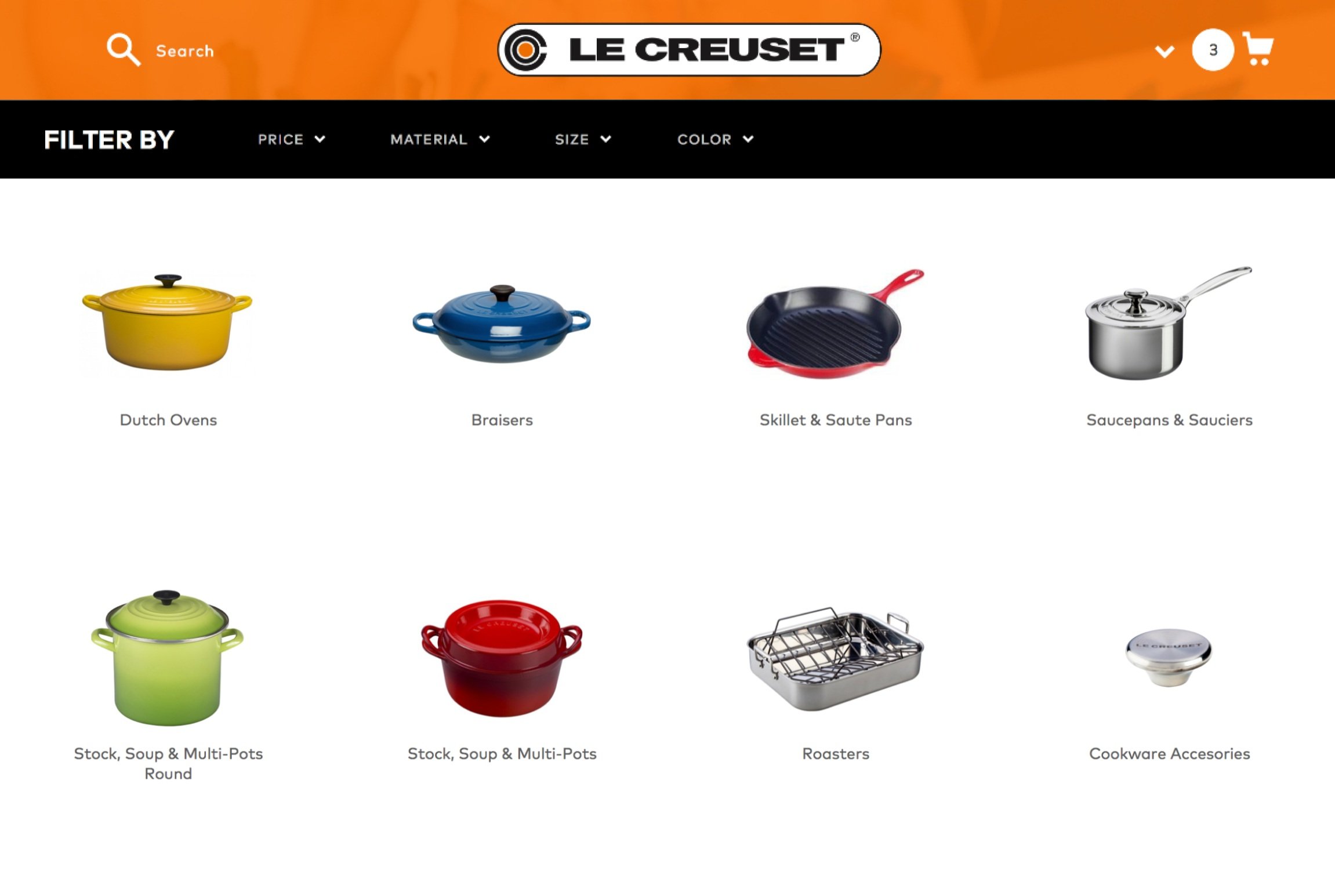
Combining user data and exploration research led to the introduction of guided user journeys and the “Shop by Color” concept. New text design was added to visually distinguish price from product choices, while also transforming text to a swatch presentation. The Category page design would harnessed best practices for presenting product results while also highlighting key differentiating features. Utilizing 2 and 4-column formats helped users quickly view products by cutting page length by 50% and showed users one step further in the shopping funnel from Dutch Ovens to Cookware category.
The serving size indicator was implemented as a way to inform the user of serving size per quart. I would also explore the idea of migrating the current LC manual into our digital experience to educate users on the maintenance and care of product materials. Navigational improvements of color toggles and a floating mini-cart was added to increase user intent and drive conversion.
HOMEPAGE NAVIGATION + TAXONOMY UPDATES
EDUCATION | LC 101
CATEGORY | OPTIMIZED FILTERING
PERSPECTIVE | SERVING SIZE INDICATOR
Validation
PROCESS | VALIDATION
To further support my design decisions and help to build a case for return on investment, I tested the legacy and optimized versions from end to end. User testing would reveal that the proposed experience was unequivocally favored due to an improved taxonomy, intuitive user journey, and humanizing design updates that prioritized accessibility & adaptability.
OPTIMIZED TAXONOMY
LIFESTYLE (HUMANIZATION)
ACCESSIBLE AESTHETIC
PROCESS | VALIDATION
Design System & Sticker Sheet
STYLE GUIDE
LANDING PAGE
CATEGORY PAGE


